
First Data Visualizations Air pollution
- Bram Vandeninden

- Apr 16, 2019
- 4 min read
In this post an update about some coded data-visualizations about a dataset with air pollution and meteorological data.
For 2 google maps routes in Antwerp, we compare air pollution concentrations and meteo conditions.
Remember from last post that the dataset contains:
* For 2 routes (about 10km in length) in Belgium,
-> Average modelled & measured air pollution concentrations. For the modelled concentrations, 2 values are available: values for a medium-high air pollution model (IFDM) and values of a very high spatial resolution model (ATMOSTREET).
-> Temperature, Humidity, Wind Speed and Wind Direction from most close meteo station
-> X,Y coordinates and some samples of air pollution high resolution modeled concentrations for each X,Y coordinate of the route on selected times and for the full year of 2017
All data are pre-processed/prepared and transformed to an usable format for data-visualization in R.
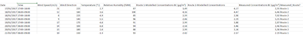

Table : sample of the data
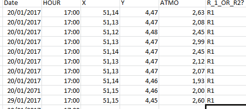
Table 2: Sample of the X,Y data for selected day (Coordinates are rounded to 2 numbers but contain more numbers).
Here below some questions to answer (based on data-visualizations) of the dataset are shown.


In this post, I will specifically focus on the following questions:
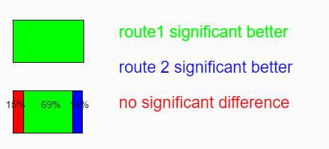
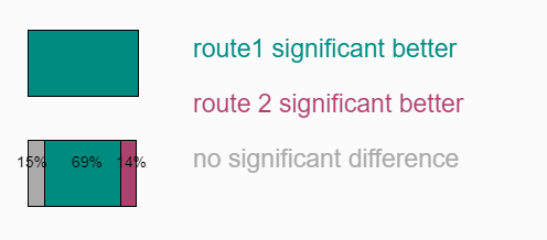
* 1) If we compare 73 days (available period), in which % of the days has route 1 a lower concentration compared to route 2 for A) The Medium-High Reoslution model and B) The very high resolution model ? * 2) How to link air pollution data and meteo-data through data visualization ?
For question 1, calculations and data-processing was done with R (based on the raw data, there is each day calculated with a t.test whether the air pollution concentration of route 1 differs significantly from route 2 (p<0.05). The result of this data-analysis is visualized. The visualization of this , I have coded both in R and P5. I coded the data-visualization first in R because I am more experienced in R, and thereafter I tried to obtain the same result coding in P5. For the P5 figures, 2 versions are shown, just to show it is easy to adapt colors and chose your desired colours, assuming you know or can look up RGB codes. Both codes are shown at the very end of this post.
This is a relatively simple data-visualization, showing that - as expected - route 1 that contains a cycling highway (car-free) for some kilometers, has in 100% of the days a lower black carbon concentration compared to route 2 for the very high resolution model (best model). The model with a lower spatial resolution suggests route 1 is only significantly better on 69% of the days.
The color hue (used identity channel) is chosen in a meaningful way: I think the colors in the 1st and 3rd figure are suitable colors (not to bright, not to dark and sufficiënt contrast between the categories).


The next figures deal with the relationship between meteo-data and air pollution data.
The first figure below shows a combination of plotting Air pollution data (y-axis), Temperature (dotted lines) and RH data (x-axis). For this figure, T and RH are divided in categorical classes. It's visible that for the dotted T-line freezing , air pollution concentration (y-axis) is higher for the lower Relative Humidity % (RH) while this is not the case for the 'cold dotted line' , which shows slightly higher air pollution concentrations for the high humidity.
In this figure, position is used as magnitude channel for air pollution values and spatial region is used as categorical identity channel for RH. For T, shape (different types of dotted lines) is used as categorical identity channel.


The last figure of this post, shows windRoses whereby the thickness of the line represents the air pollution concentrations of Black Carbon divided in 4 categories. The length of each line corresponds with % of the time the wind was blowing from that direction. For both routes , route 1 and route 2, a windrose is plotted.
During the considered period, we see that the highest air pollution concentrations occur, both for route 1 and route 2, when the wind is blowing from the SouthEast. It is also visible that the lowest concentrations occuur the most when the wind is blowing from the SouthWest and the NorthEast. During the considered period, the NorthWest was one of the least occuring Winddirections, and we see that when the wind was blowing from the NorthWest, the concentrations were as good as always not in the 1st categorical class of air pollution (higher concentrations than the first class of 0-2 µg/m³).
The windroses are plotted using the openAir library package in R.
In this figure, Area is used as magnitude channel for air pollution values. Position on common scale is used to display the wind directions.


In a next posts, expect more answers on more questions and more in-depth visualizations of the topics that were raised in this post.
---------
The R Script for question 1:
##Script to generate barcharts
par(omi=c(0.0,0.75,1.25,0.75),mai=c(1.6,3.75,0.5,0),lheight=1.15,
family="Lato Light",las=1)
# Import data and prepare chart
myC1<-rgb(0,130,129,maxColorValue=255)
myC4<-rgb(175,65,110,maxColorValue=255)
mycolours<-c("grey",myC1,myC4)
myData0<-matrix(1:12,nrow=2)
colnames(myData0)<-c("A","B")
myData0[1:3, ]
myData1<-cbind(myData0[,1],myData0[,2])
myData2<-t(myData1)
myData1[1,2]<-0
myData1[2,2]<-100
myData1[3,2]<-0
myData1[1,1]<-15
myData1[2,1]<-69
myData1[3,1]<-16
# Create chart
x<-barplot(myData1,horiz=T, border=NA,xlim=c(0,100),col=mycolours,axes=F)
# Other elements
# Titling
title("Antwerp 2 routes")
mtext("All values in percent",1,line=2,adj=1,cex=0.95,font=3)
text("All values in percent",1,line=-25,adj=1,cex=0.95,font=3)
mtext("N=73",1,line=2,adj=0,cex=1.15,family="Lato",font=3)
mtext("Antwerp",1,line=3,adj=0,cex=1.15,family="Lato",font=3)
mtext("0%",1,line=-10,adj=0,cex=1.15,family="Lato",font=4)
mtext("100%",1,line=-10,adj=0.5,cex=1.15,family="Lato",font=4)
mtext("0%",1,line=-10,adj=1,cex=1.15,family="Lato",font=4)
mtext("15%",1,line=-2,adj=0,cex=1.15,family="Lato",font=4)
mtext("69%",1,line=-2,adj=0.5,cex=1.15,family="Lato",font=4)
mtext("16%",1,line=-2,adj=1,cex=1.15,family="Lato",font=4)
mtext("Black Carbon Medium-High Resolution Model (IFDM)",1,line=-12,adj=0,cex=1.15,family="Lato",font=3)
mtext("Black Carbon Very High Resolution Model (ATMOSTREET)",1,line=-7,adj=0,cex=1.1,family="Lato",font=3)
legend("top",legend = c("No significant (p<0.05) difference", "Route 1 significant better","Route 2 significant better"),
fill = c("grey", myC1,myC4))
The P5 script for question 1
function setup() {
createCanvas(900,400)
fill(0,139,129)
rect(200,200,100,60)
fill(0,0,255)
rect(300,200,0,60)
fill(0,139,129)
rect(215,300,69,60)
fill(170,170,170)
rect(200,300,15,60)
fill(175,65,110)
rect(284,300,14,60)
fill(0,0,255)
rect(300,200,0,60)
textSize(23);
fill(0,139,129);
text('route1 significant better', 350, 225);
fill(175, 65, 110);
text('route 2 significant better', 350, 275);
fill(170,170,170);
text('no significant difference', 350,325);
textSize(14);
fill(0,0,0);
text('69%', 240, 325);
fill(0,0,0);
text('15%', 190, 325);
fill(0,0,0);
text('14%', 280, 325);
}


Comments